Monólogo Identity
Define and structure a brand in all of its lines of communication
The cartography of a brand
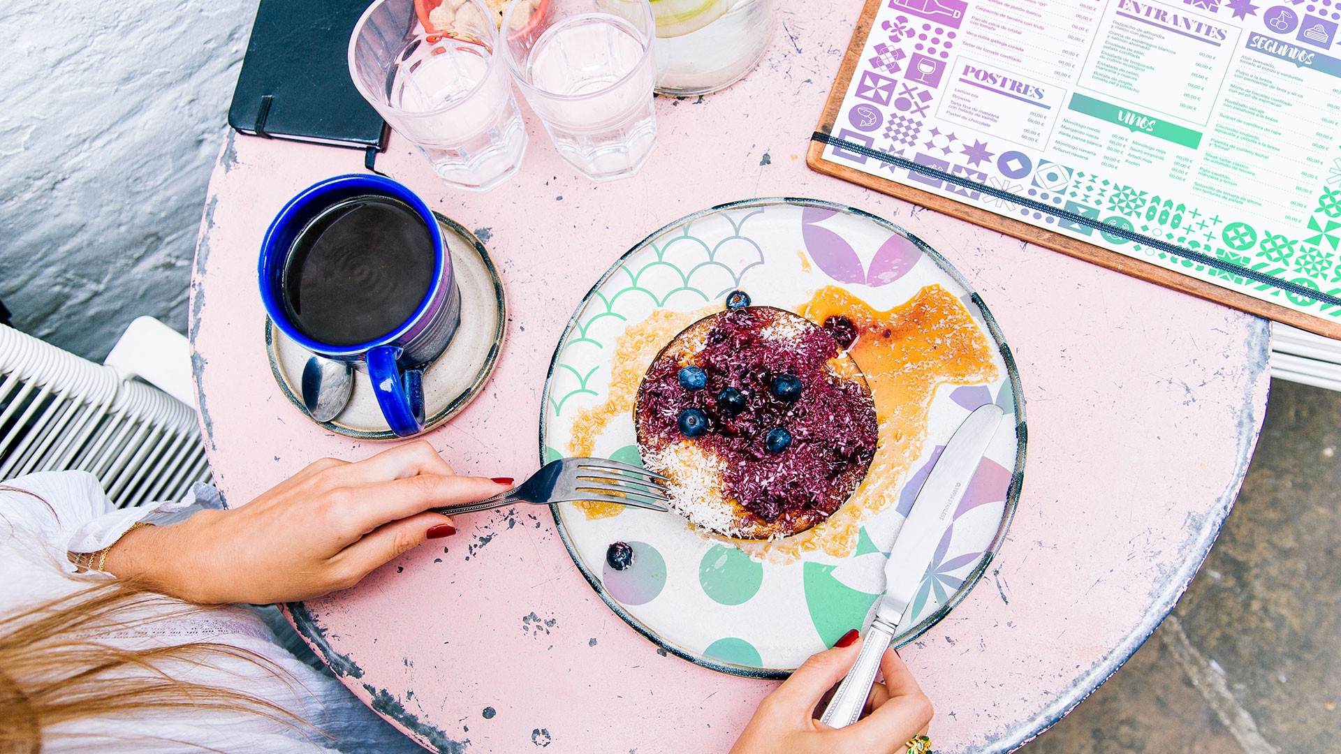
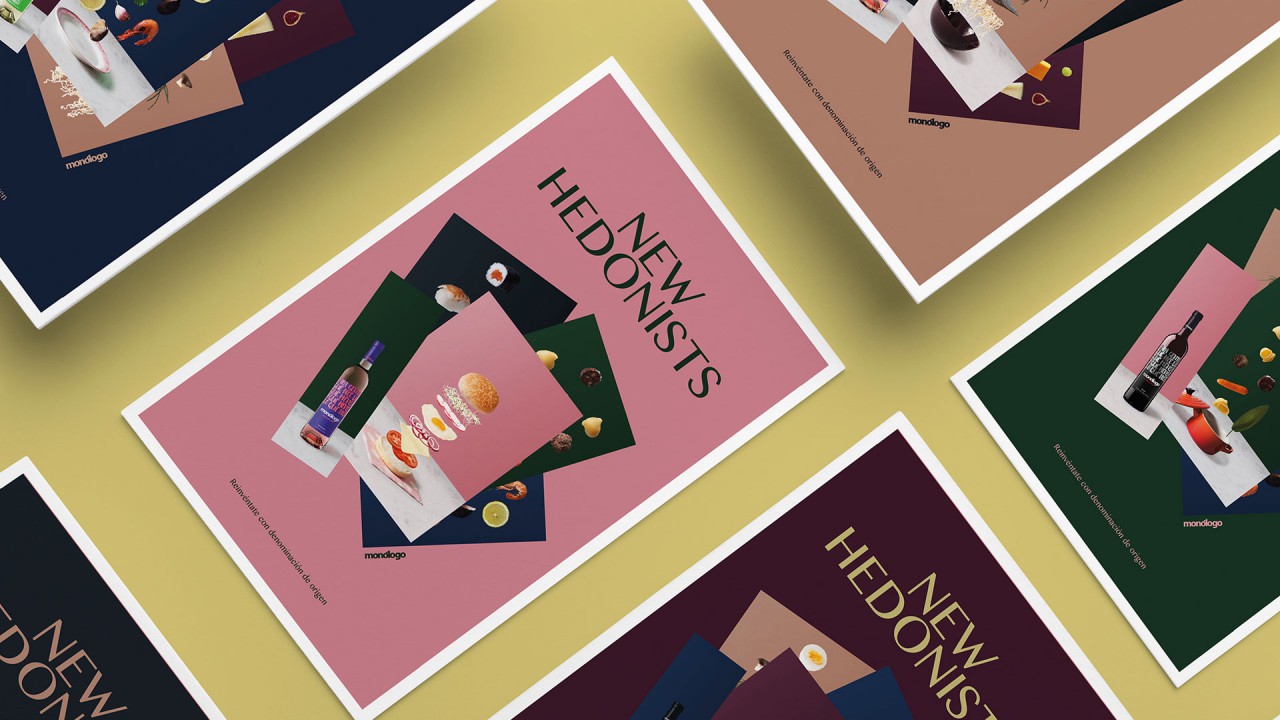
Over the last few years we have created a new way of speaking for Monólogo and an absolutely original brand identity within the Spanish wine world. Furthermore, we have established a strategic plan based on our own original concept: the democratization of the world of wine. We have launched collective creation campaigns, designed the labels of their bottles and produced all the contents of their social media. With all this background, the concept territory and the positioning we have established, and as a logical consequence to all this line of work, we created and conceptualized the style guide of Monólogo for all its communication, specially focused on the hospitality industry.
The idiosyncrasy through colour and typography
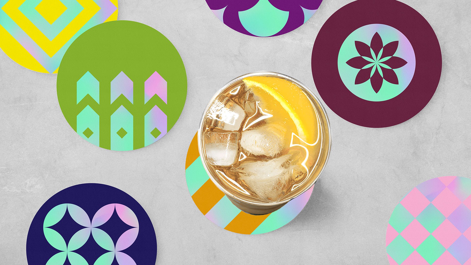
The use of intense colours and the dynamic combination of different typographies is one of the main characteristics that define the graphic territory of Monólogo. On the one hand, colour is a fundamental part of the DNA of the brand, something that can be observed everywhere from the bottles themselves to any piece of communication. We use primary, secondary and tertiary colours, with special attention to the neon ones, to highlight, differentiate and, above all, emphasize the philosophy of a disruptive and vitalist brand. On the other hand, the interaction of three typographies as different as Salomé, Helvetica and Brusher, obtains dynamism and fluidity. In a brand in which messages and quotes are a basic part of its communication, this combination provides each of them with a unique entity. To enlarge the resources of the brand, we add pictographic illustration to the use of colour and typography as a third element that expands the margins of Monólogo.
The modular system
Starting from basic geometries such as the circle, the triangle and the square, we developed a new system of shapes that defines an absolutely recognizable branding. From this initial nomenclature, we designed 54 geometric shapes that open a wide range of combination possibilities. Geometries to which any of the colours that identify the brand can be applied. Each of these shapes was delimited by a module. The modules also included different typographies and pictograms and can be combined to create patterns that suit all uses in a heterogeneous way. Thereby we had a completely versatile modular system that permits application to all types of formats in a highly identifiable manner.