Oqan
The design of the present and the future of a new brand
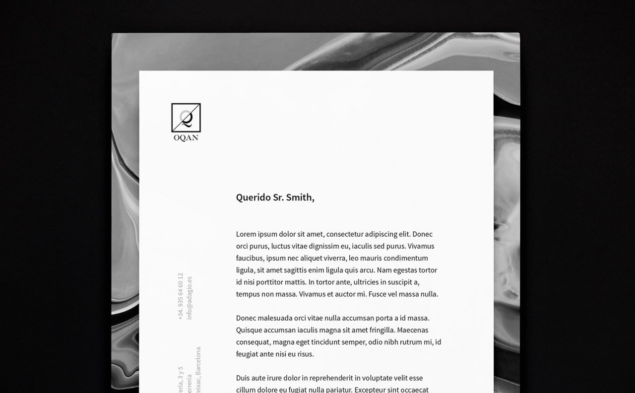
The birth of a brand
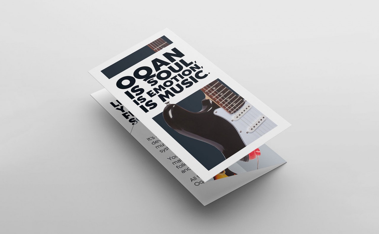
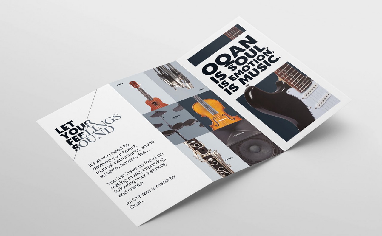
Adagio Group is the leading company in the distribution of musical instruments and professional sound in Spain, Portugal, Italy and France. After 40 years of history and with the desire to continue expanding its influence in the sector, Adagio decided to create its own brand of musical instruments. A project of brand and identity creation completely developed from scratch by CATandCAT, former agency of our co-founder and creative director Maider Mendaza. During the work of creating the brand we reflected deeply on the very nature of music and understood that it is a language that speaks directly to the emotions, to the soul itself. For this reason we are inspired by the word ‘okan’ which in the Yoruba language means precisely that: ‘soul’.
The nature of duality
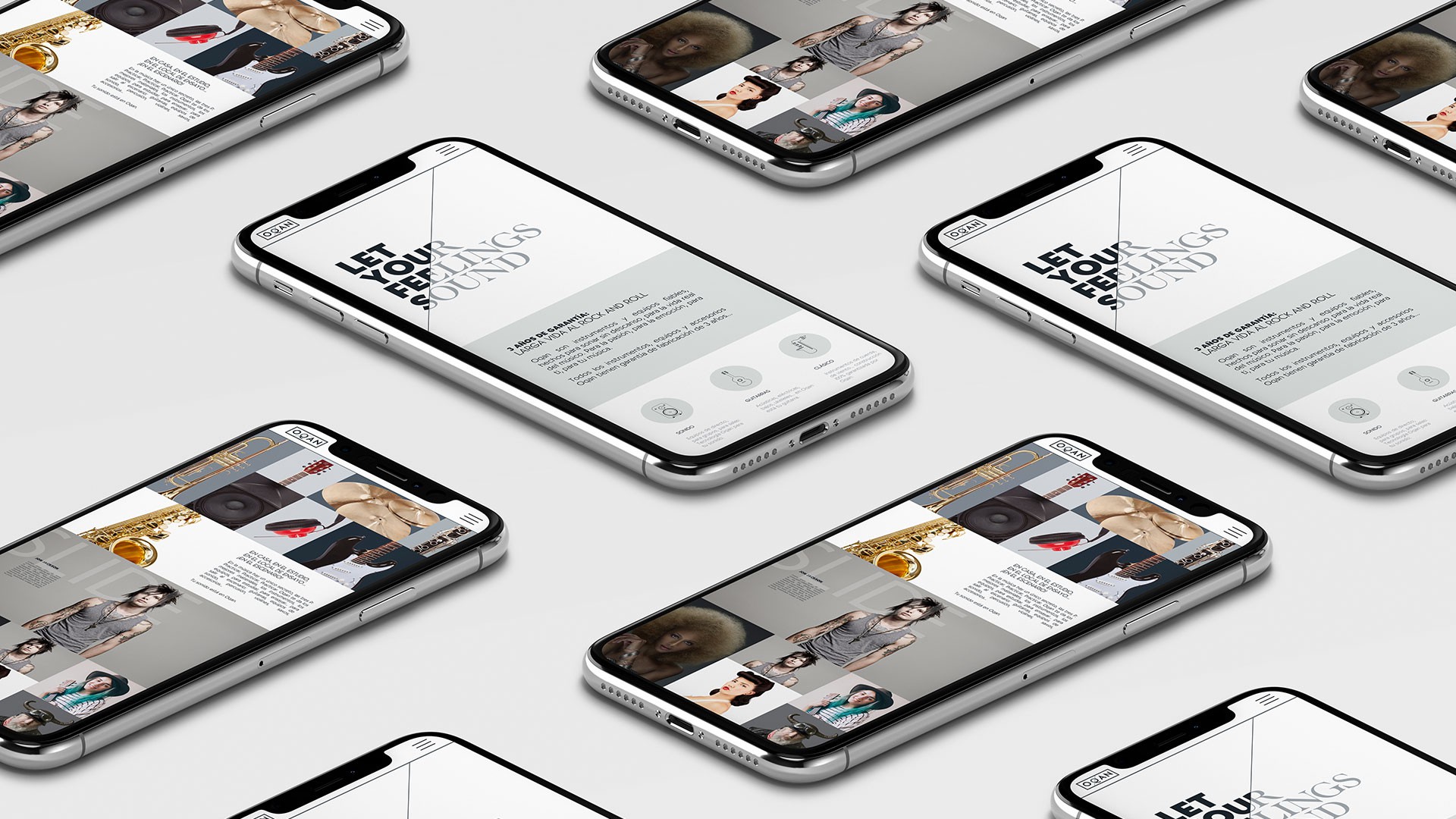
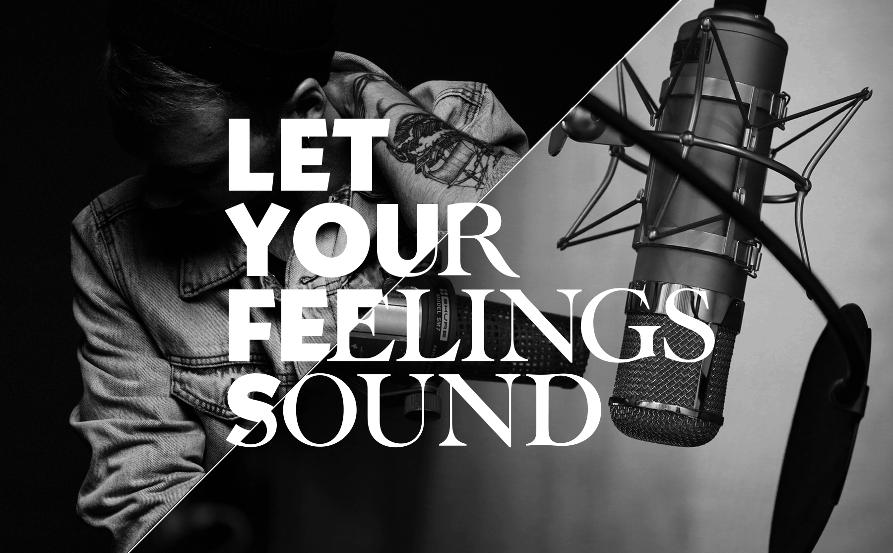
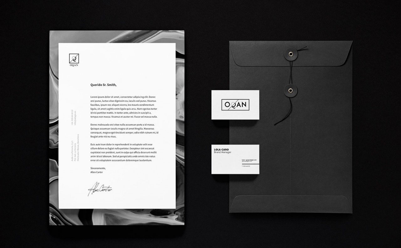
The conceptual framework we developed was based on the idea of duality, understood from an emotional point of view. Just as a song is capable of transmitting a wide range of emotions: from joy to sadness, from hedonism to reflection. We graphically plot this dichotomy with the direct application of the cut on the layout, the photographs and the typographies themselves, which allowed us to contrast concepts and find their connection points in a fluid and natural way in the same way as the music itself.
Contemporary Classicism
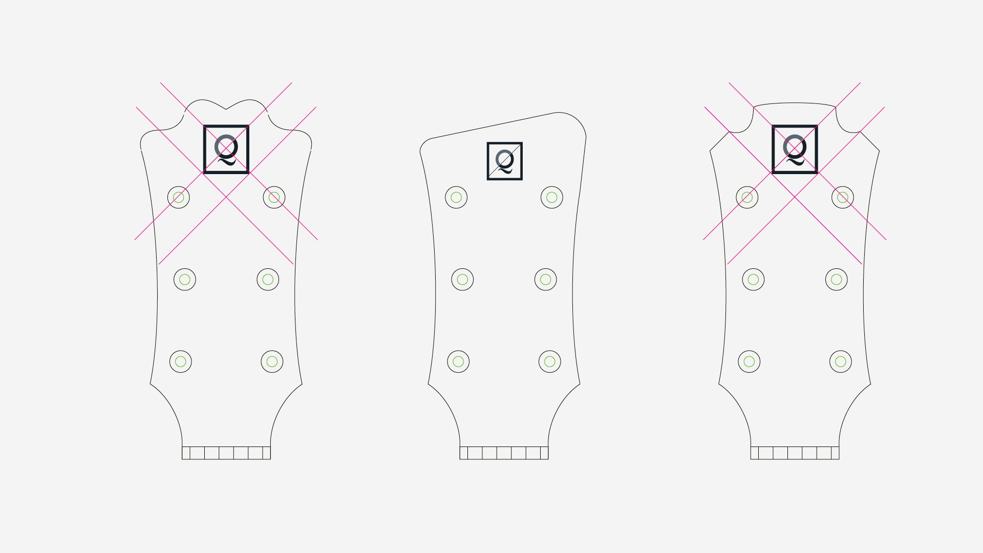
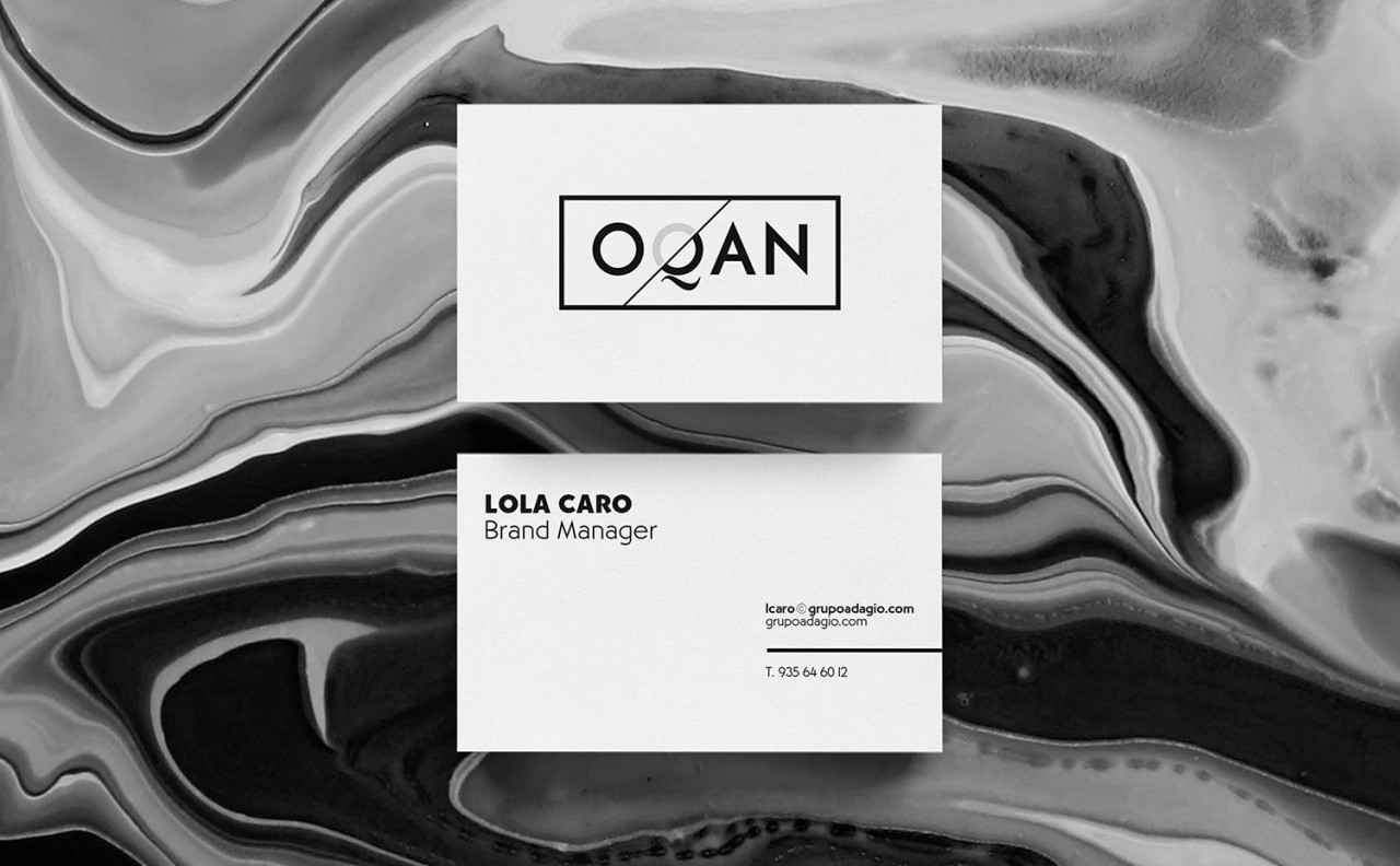
We evolved the concept of duality with the use of two contrasting fonts in a territory design based on a colour code as essential and at the same time elegant as black. A colour that transmits a return to the classics but also a profound sense of modernity. A typographic and chromatic work present in the entire identity of the brand and in its own logo, in which we use the letter Q to translate the K sound due to its strong symbolic load and its greater sophistication. A Q that took a protagonist entity throughout the proposal since its own form refers to the origin of music itself: the mouth of an instrument, the cone of a speaker and even a musical note.
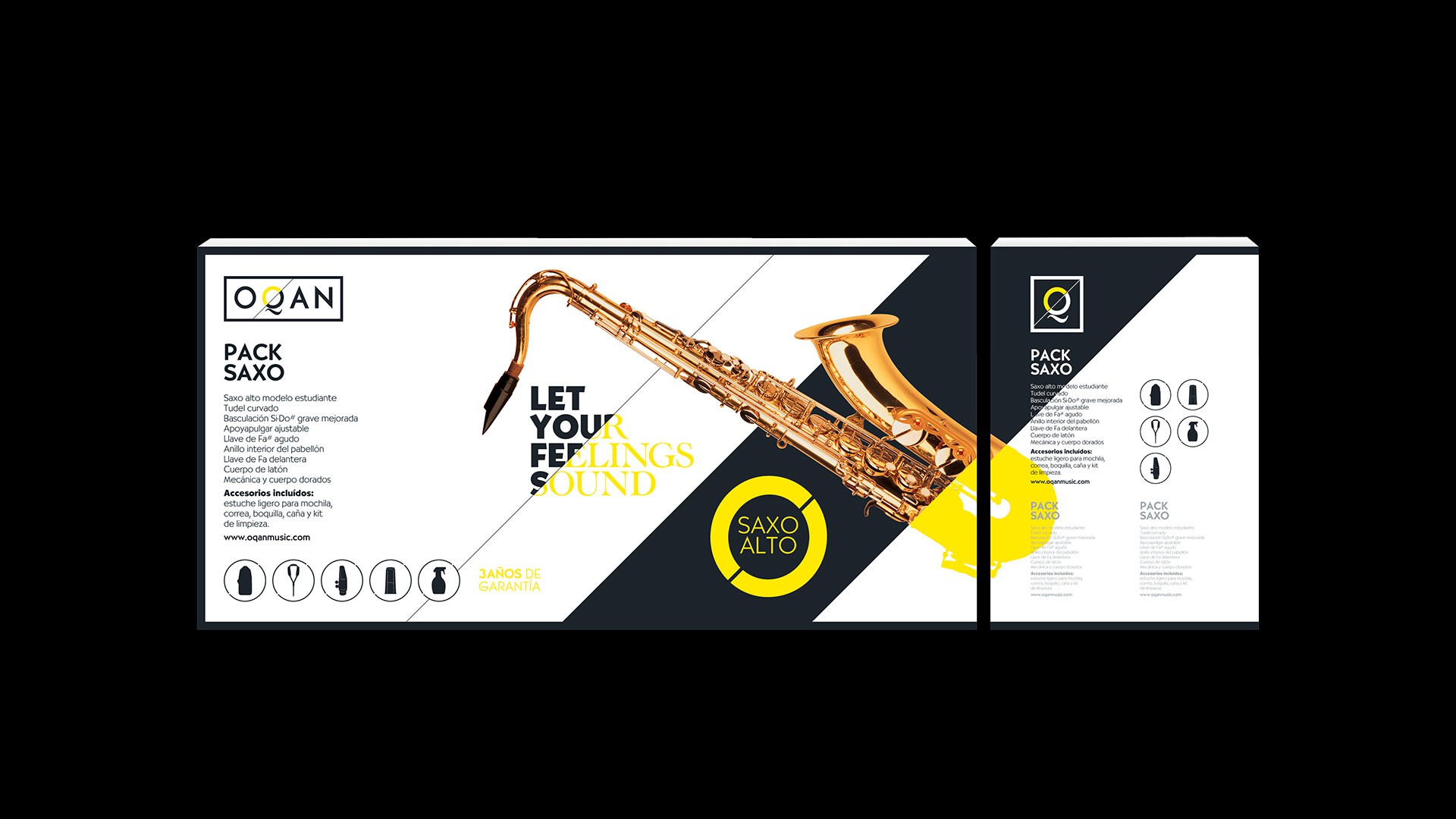
Taxonomy through colour
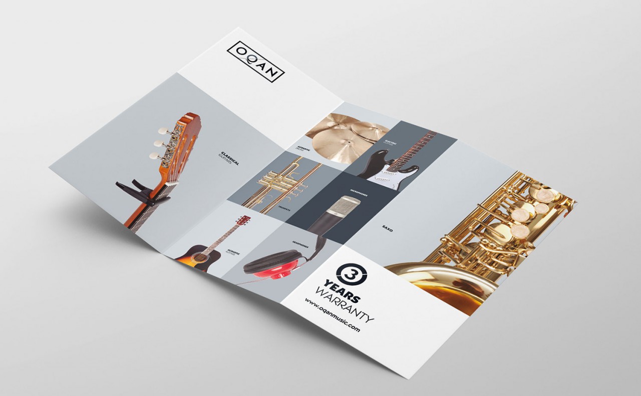
We arranged the great quantity of products of the brand through a chromatic classification of the different typologies of the instruments, accessories and sound equipment. In this way, we developed ranges and lines based on the application of a scale of intense neon colours that, in contrast to the basic identity created through the black, provide a clear brand personality and create a visible and evident differentiation through the application of the respective colours.