Ella Speed
The launch of a new band on the Barcelona rock scene
The contrast as a concept
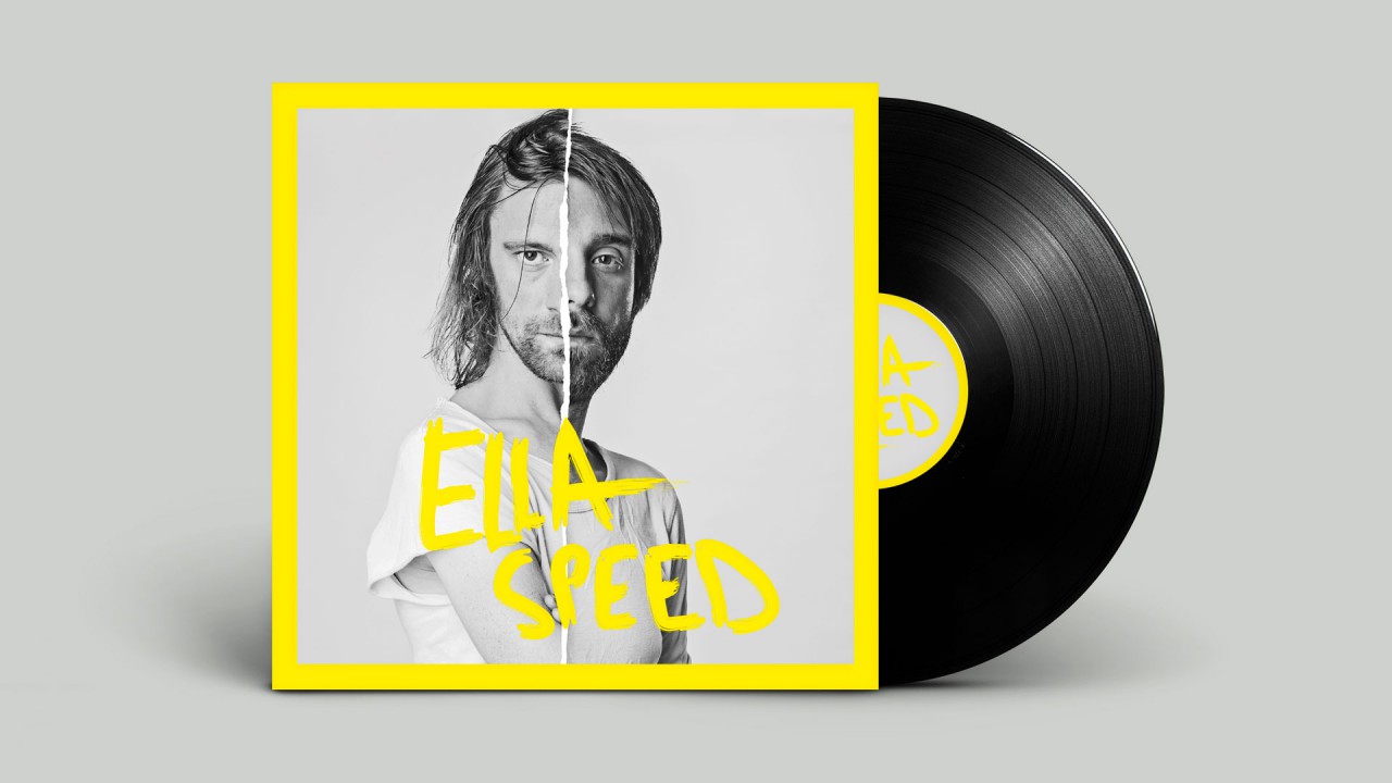
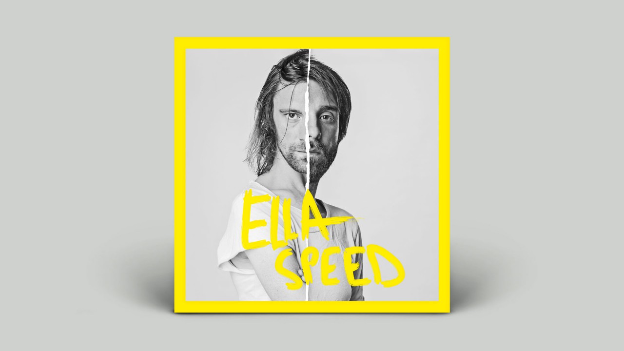
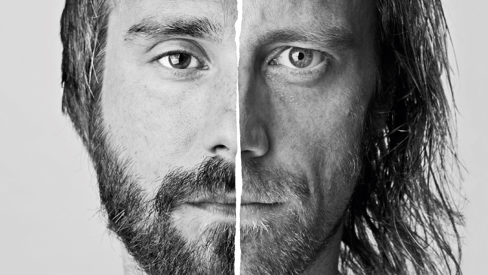
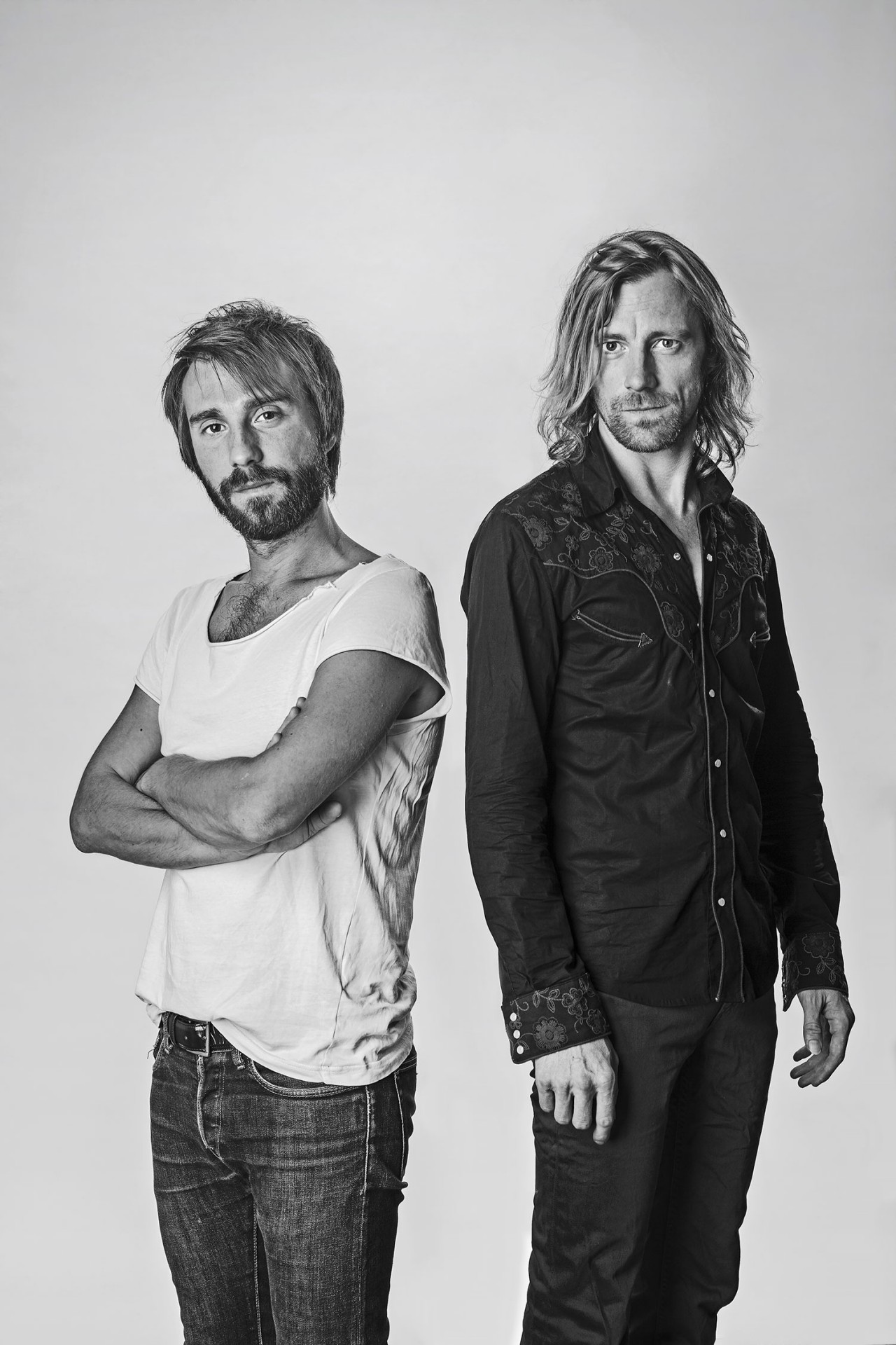
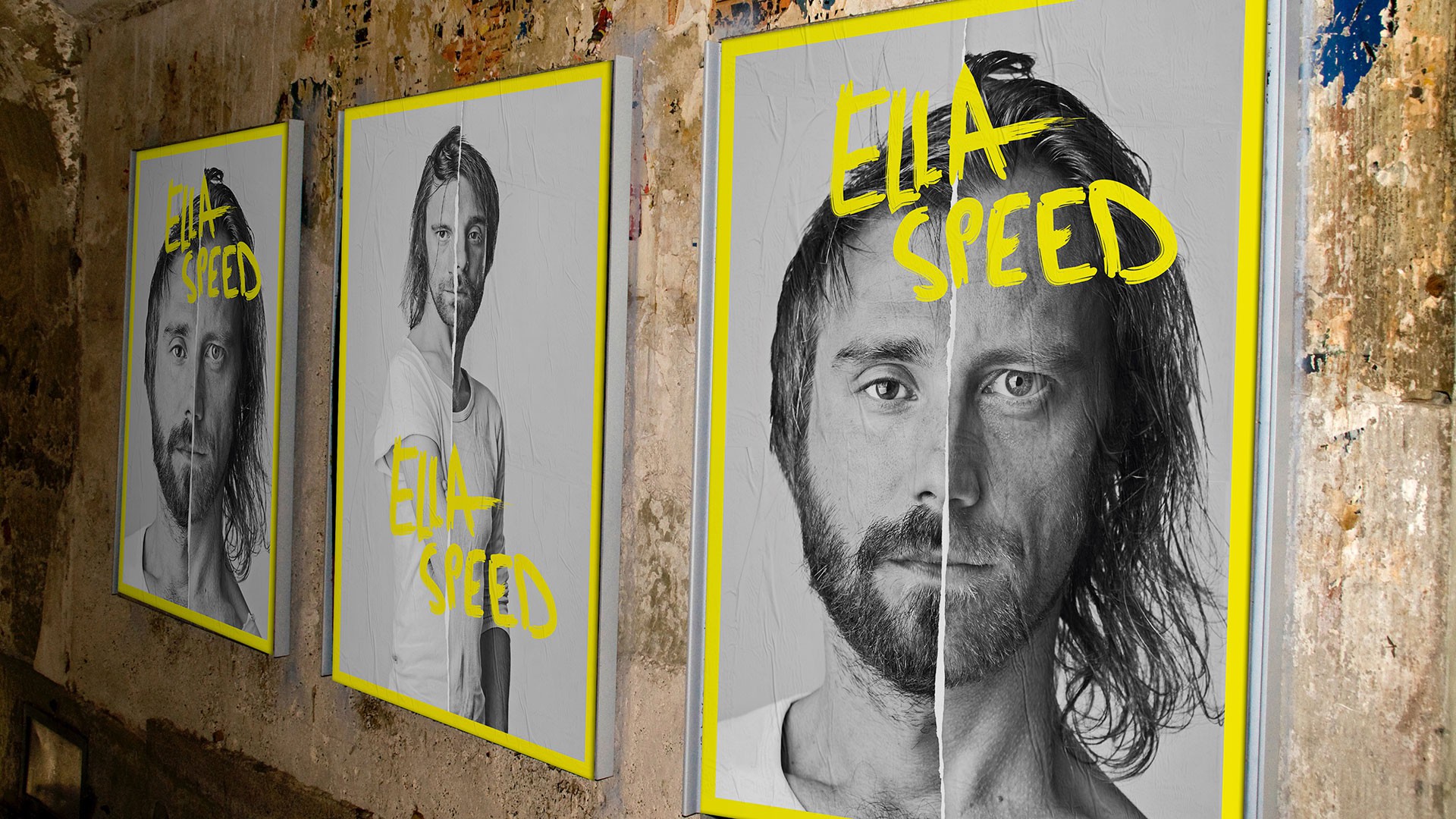
Ella Speed is a duo that moves between the rhythmic patterns of Blues, the second line of New Orleans and the impossible agreements of noise and 90’s shoegaze and garage. Its music is raw, visceral and explosive, a constant combat between the Dutch guitarist Rik van den Bosch and the Majorcan drummer Luis Bestard. For the creation and design of their debut EP ‘Jump for joy’, we wanted to capture this tension through the visual concept of contrast. Black and white versus colour. Two faces that are one. Minimalism and expressionism. Duality as creative energy.
Expressionist minimalism
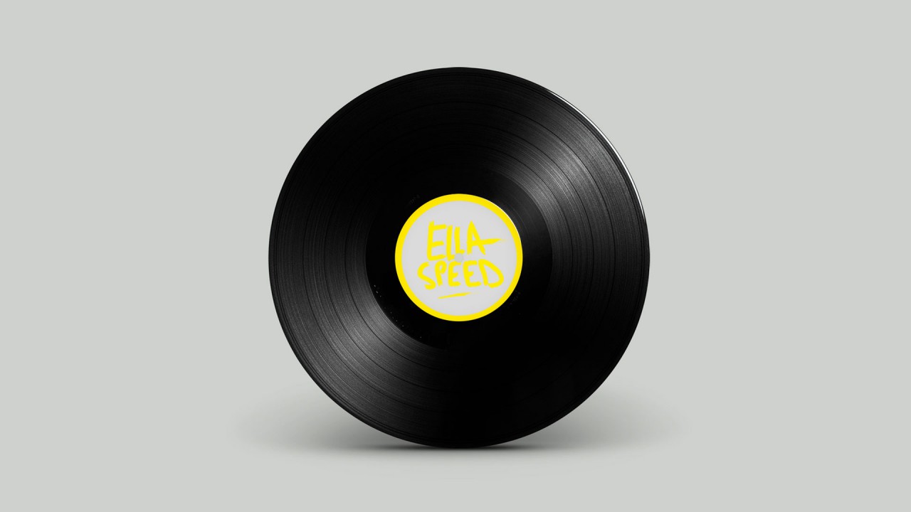
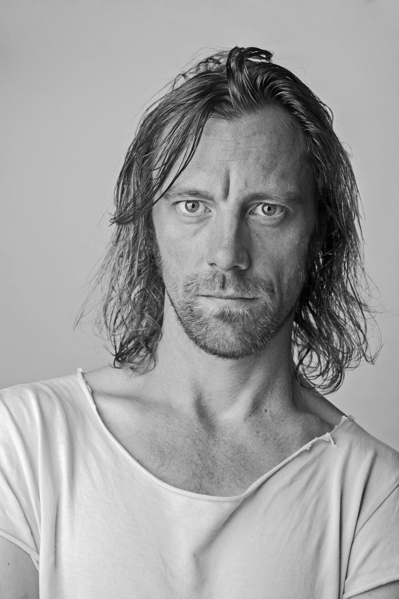
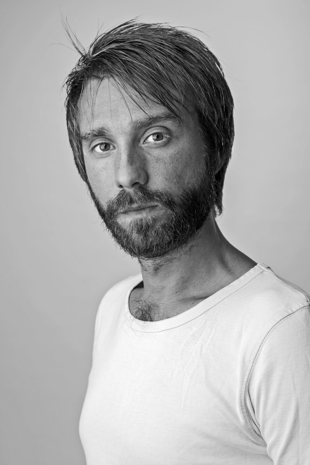
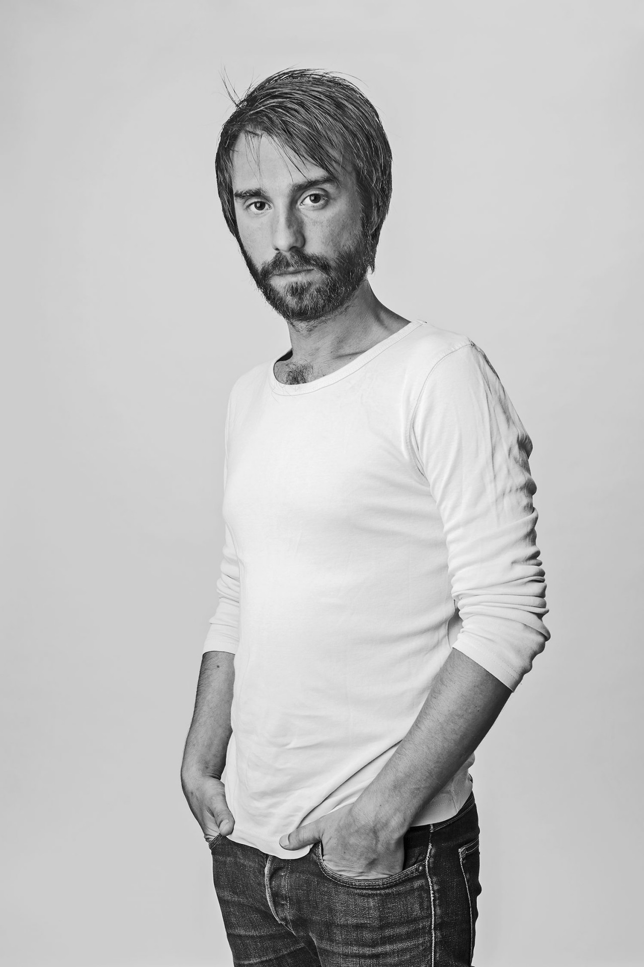
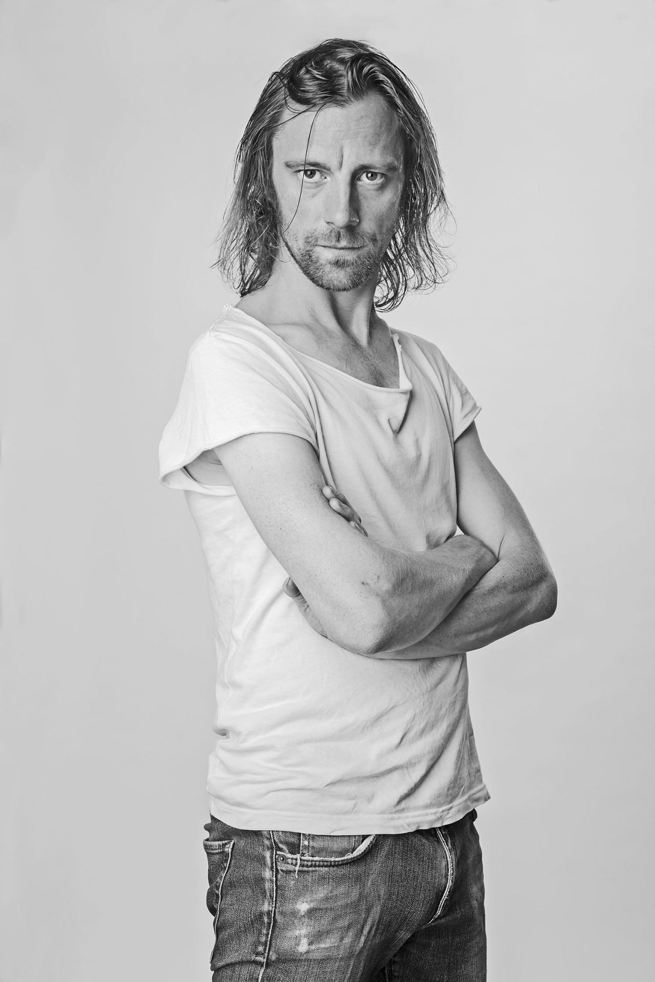
Duality and contrast are the axes of the visual identity that we created for Ella Speed. The images are in a clear and clean black and white hybrid with the intensity of a powerful yellow. A chromatic shock that finds its correspondence in the handwriting logotype we designed for the band, which reinforces the hardness of its strokes when it is applied on the grey and minimalist background of all photographs taken by ourselves.
Rethinking the symbols
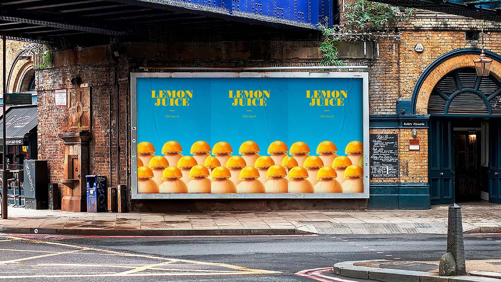
Months after our first collaboration, Ella Speed released their second EP ‘Lemon Juice’. To be able to convey the musical heritage of the band and their personal scoundrel adaptation to today, we worked from a completely conceptual perspective and we sought to create an absolutely iconic image, full of irreverence and irony, with a playful, vintage vision of sexuality: something that remains ingrained on your retina from the first moment you see it. A new twist to the contrast as a concept.
